
Want to know EVERYTHING you need to know about building SUCCESSFUL landing pages that get eyeballs from casual readers and turn them into subscribers or customers?
This post is written specifically with THIS purpose in mind. Read on.
What is a landing page?
A landing page is a page on your website where your customer is ‘expected’ to land first. This is self explanatory, right?
Wrong. That is pretty much what a home page also does, to an extent.

Table of Contents
- What is a landing page?
- Table of Contents
- Introduction
- The difference between a Home page and a landing page
- Why build landing pages?
- What I observed from successful landing pages
- Elements of a successful landing page – Building STEP BY STEP
- Long vs short length Landing pages – What is better?
- Okay. I am sold. I want to create my own Landing pages
- Conclusion
Introduction
Let me explain. First, forget the home page. Examples and pictures are the best ways to explain any topic. So that is what I will do. Definitions do not work as well.
Imagine you are a online tea selling business. You already sell regular packages of various flavors and get decent traction on your site.
Now you want to get premium customers to your site with a special package of Darjeeling tea reinforced with other herbs. You want to highlight this offering to your premium customers.
So what do you?
You can create a landing page that is like this below.

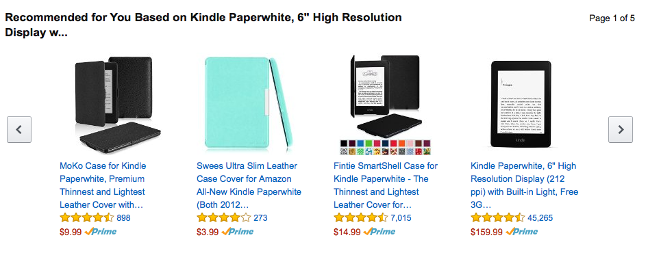
Now you can do targeted ads or social media posts with this as the link. Not only do you target your existing customers with a special page, but even new customers looking for it will be able to see it.
They will have two choices. They will either accept or reject it.
That’s okay. But restricting the visitor who searched for ‘premium tea’ will ONLY be looking for your Darjeeling tea package. They will not be interested in your other offerings. This way, you increase your chances.

Don’t take my word for it.
Google has been taking this seriously since 2003. Check their patent.
So, you can have special landing pages for each of your marketing campaigns or products or groups of products – this is your call as business manager.
The difference between a Home page and a landing page
The home page is the page that loads when you go to your root domain of your website.
For example, thecodepost.org is a root domain. The page that loads is my home page. Incidentally, that is also a landing page. That is because I want readers visiting my root domain to CONVERT or BUY my services and not necessarily read my blog posts. I am free to have another separate landing page to host some of my best blog posts or a series of posts covering a particular topic.
It is important to note that every website will have a home page.
Can a website have no landing pages?
Of course, it may not have a specially designed landing page. If targeted selling of a product or an idea is NOT required, a landing page is not necessary. Online personal blogs for instance do NOT require landing pages.
Can the home page be the only landing page?
It may have many landing pages. The home page may be a landing page. This is your business decision. Your product and marketing strategy will define how many pages you should have.

For example, if you have a special USP for a particular product, even though you sell many – you can create a landing page for that particular product. You may build multiple landing pages for each of your products or services as well. This increases your cost, though and may end up confusing your customers and make your marketing efforts more difficult. I will recommend you start with only one or two landing pages highlighting mutually exclusive services or products. One of them can be your home page as well.
Why build landing pages?
Landing pages should have ONLY one purpose.
To convert.
First impressions matter. A LOT. Research shows that this is TRUE and not just a cliche.
Instead of your regular website that has links to every other page (internal links in moderation is good), you should have a single page for a single purpose.
Let us see some examples. This will help me drive home the point.
Take this page of Udemy for instance. This page is INTENDED to get teachers enrolled in the system.

This is how their home page looks like.
How many links does it have?
This home page is NOT intended to be appealing to teachers. Hence, a separate page for teachers and another for students (buyers) make sense.
Let me show you another example.
Have a look at Zerodha. This is the most popular trading website in India right now and has one of the highest traffic in the world.

Compare their home page and this page that showcases their products.
What do you notice?
What I observed from successful landing pages
You can check for more examples of successful websites that have milions of users visiting them. You will find something in common among them.
I have visited, studied and analysed what THEY broadly do to drive more traffic to their websites. Let’s get started with what I found.
- They have landing pages for particular offerings and each of the pages cater to a specific offering
- The color combination is such that the focus of the viewer stays on the page
- The benefits of the offering is made clear right away. There are not big notes. Text is short, crisp and usually has simple but relevant graphics.
- There is a Call to Action. But there is usually ONLY ONE call to action.
- The pros or cons have bullet points. This helps a viewer make a mental note about ‘ticking the checkboxes’.
- There are often some method to sign up and/or share the content with other people easily – like social sharing buttons.
I will highly recommend you do this study independently on your own as well. The context of your target sites may be very different from that of mine.
How?
Take for example scientific research related websites or blogs. Their audience is very different from that of mine. Naturally a minimalist design may not be best suited for your niche.
Otherwise, for a general puspose domain, these suggestions will work fine. You should still have a couple of plans at least and do a A/B testing to come to a conclusion that stands firmly on the data that you collect.
Combining the above observations together gives us an anatomy of a landing page that guarantees more user engagement.
Elements of a successful landing page – Building STEP BY STEP
A landing page should typically have the below outline. I will explain how you can go about each of them in detail as well.
- A super cool and engaging title and meta description
- A Magnetic headline
- Hero shot featuring your product or service (singular)
- A basic call to action (this is optional here). The advantage is that this is probably going to be ‘above the fold’. What is ‘above the fold’? It is the part of the webpage that loads on your screen first, without you having to scroll down.
- Benefits, features and/or pricing
- Social proof – some testimonials, reviews, photos of your products or services
- A great Call to Action
Now let’s look into each of these.
Create a great engaging title and relevant meta description
There are a great many tutorials on writing headlines and titles. But let me make things simpler.
Let me begin with asking you a few questions.
Q1. How many search queries do you make in a day?
Q2. What do YOU consider when you click on a page from the search results page?
Q3. How many such pages do you read from start to finish?
Your answers to the above questions will help you understand the requirements of readers in general.
For example, the answer to the first question is simple – you make numerous search queries a day. We put in our keywords and hit on the search button. Then we look for the most ‘relevant looking’ result from the results page.
The answer to the question 2 is similar. We ONLY get to read the title of the page that comes up on the search result. There is another little text below that is called the meta description.
Note that the meta description plays no role in Google deciding the page rank. It only helps in the reader understand the relevance of the page.
The answer to the question 3 will depend on various factors. But the relevance of the title, the headlines with the content is crucial. Otherwise, readers will just drop off.
This is what people usually do. For statistics, you can head over here for the details.
First, let us look at the title.
Writing Titles for pages that invite user clicks
Title tags are super important. They appear everywhere.
They will show up on the search results pages.

Social media snippets will show them and when you load them up, you will find it on the browser tab as well.

So why are title tags important?
It is because they help make the reader decide if the page is relevant for their search query. That is why search engines will ALWAYS consider titles as ranking signals for any given search query.
Title tags and the associated meta description go hand in hand. But there are important points to consider.
Title tag length
Title tags are shorter and should typically have up to 60 characters. That way, most search engines will be able to show the entire title that your page has.
Keep your title tags unique
You don’t want to have duplicate titled pages for your own website. That would confuse the readers. We don’t know how the search engines treat such cases, but common sense indicates that they WON’T love this.
Keyword Stuffing is NOT the answer. Relevance is.
Stuffing all the keywords that you want your page to rank for in the title is a BAD idea. Ensure that the page is relevant to a search query and focus on the internal content.
A good idea to improve relevance is to keep the keywords in the beginning of the title.
For example, check this page title below.

Even though the page has a pretty large Title, what it shows up in the URL is much shorter. Check the importance of the title itself.
There is an ACTION and a SOLUTION to a problem that the author wishes to convey. This strategy works.
The title tag is the gateway to a successful engagement. This is actually the first step to beginning the customer journey.

Effective Meta descriptions that improve CTR
I have mentioned before, but let me reiterate this. Google does not use meta tags for ranking pages. But they matter a lot to users.
Remember the previous image where the title was present along with a description. If you don’t manually decide what the meta description is going to be, Google will pick out the relevant portion from your post and put in the first 155 odd characters for the same.
It is possible and recommended that YOU control what goes into the meta description.
Here is what you can do.
This is basic human psychology. It will make sense.
When a user searches for something, you know ONE thing about him. He IS obviously searching for the search query. You can respond to this query by
- Including and prioritising keywords of the query in your meta description
- Focus on the problem in brief
- Provide the promise of a solution
- A simple call to action. Just tell the user what to do.
Prioritising the search keywords is easy. Put them first as much as possible.

Take for example, the search query is ‘tofu sandwiches in Hawaii’. Your description can be something like this below.
Looking for Tofu sandwiches in Hawaii? Dipped in exotic ketchups? Cruelty free? You get it all. Drop by our store or order them from your place from us.’
It looks simple. But look what has been done. The highlights are added.
The first highlight is a direct keyword entry. This gives you relevance. Since search engines don’t care about it, the focus is on the user’s engagement.
Next are the benefits. ‘Exotic ketchups’ and ‘cruelty free’ are both benefits. The latter is even contextual.
Finally, I top everything off by simply suggesting the user what to do. The user can ‘get it all’ just by dropping by at the store or ordering ‘them from your place’.
In short, there is
- Relevance
- Benefits and
- Call to action
A couple of points to remember.
Even though Google does not use this to rank your page, stay clear of duplication content. In this case, duplicate meta descriptions will hurt you.
- Keep the descriptions short. 150 to 155 characters is the most you should go for.
- Avoid duplicate content and keyword stuffing. Google will, at best, ignore it.
Write killer headlines
If titles and meta descriptions are the key to your page, headlines are the drawing rooms. They decide what the user can actually expect from a page.
There are a few key points that you can keep in mind while writing a great headline.
- Include specific numbers or data. Headlines like ‘7 top reasons why …’ work great. Numbers are like brain candy. They hook users to the content. As long as the rest of the content is relevant, you are good to go.
- Call for attention of the user. Remember what I said about the meta description and the title tag? You know something about the anonymous user. You know the user is searching for a particular keyword. Use this formula below to pick a good headline for your page or post.
- Use emotional headlines. Research suggest these work best.
- Take the local context into account. For example, in the case of the USA, putting the word ‘Trump’ in the headline will probably increase your chances of making users read the content. This may sound a bit tricky, but as long as you keep it relevant, you are fine.
The best part is that there are tools that already exist that make the task of choosing the right headlines for your page or post very easy.
Some of these tools are listed below. These are not in any order of usefulness. Try them out and do a A/B test to check for efficacy.
- CoSchedule Analyzer – perhaps the most popular of such tools that exist as of now. All you have to do is punch in the headline that you have in mind and it will give you its strengths, weaknesses and suggest you places where you can improve it. One major problem is that you will have to register with your email address. But that is the price you have to pay for using a comprehensive headline analyzer tool.
- Sharethrough Analyzer – apart from checking your headline, this gives the impression and engagement score. The engagement score is nothing new. But the impression score has additional benefit of putting brands that catch eyeballs. Play with this free tool to get the best results. Test multple headlines to check for the best CTR.
- Capitalize headline Analyzer – This tool is much more comprehensive than the two before but has some issues with the SEO related relevance. This will give you the readability, SEO and sentiment tests. The results are a bit odd at times though. Even then, I recommend this one over the other two. Again, before you come to a conclusion, use your own manual multivariate testing to decide what’s best for your website.
There are others, but these 3 headline analyzers should do the job as well.
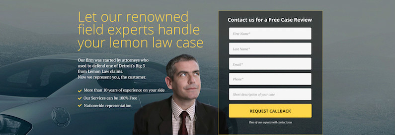
The perfect Hero shot for a Landing Page
Okay. So what is a hero shot?
Check this screenshot below.
This is a hero shot. There is an image with text overlay. The positioning of the text will vary. This, however, is NOT the best way of using a hero shot.

Here is another. This guy has been covered before in this blog as well.

So what is required for a hero shot to be effective and drive traffic?
There is hardly a formula that works for everyone. Unbounce suggests testing extensively over time to come up with a solution that clicks with your viewers.
There are a few common points that we can conclude.
- Decide the Male/Female/Other gender for the character, if you are using a character for the shot. This entirely depends on your customer base.
- Geographic locations are important. It makes NO sense to put smiling Caucasians for a Indian Energy Consultancy for instance. It does not inspire confidence in your brand.
- Provide a solution to the customer’s problem. This is similar to finding the perfect headline above. The idea is simple. Find a problem, provide a solution and highlight the steps one needs to take to acheive the same.
- Put in a call to action nearby so that the reader knows when to click and where. Also, explicit clues to what readers are supposed to do – HELP. Sounds counter intuitive, I know. But it works.
- Include only a single product or offering for the hero product. If you have multiple things on sale, just create separate landing pages for each one of them.
Create Thank You Landing Pages
You must have seen these.
There are landing pages that are used to convert by promising value.
Then there are landing pages that simply thank the reader. Some sites provide free goodies in return. You must have seen examples where FREE PDF copies of books or coupons for products are provided.
How does this help?
You can do all the following. I will add examples below. Don’t worry. This is a gist.
- Increase your sales
- Promote your brand
- Ask for feedback and connect
Increase your sales
Okay. So the customer has already bought something from your site.
Or, he/she has registed or subscribed to your newsletter.
What does this imply?
INTENT.
The single most important currency you have on the Internet. The only thing that actually matters.
Ecommerce websites often push further product recommendations that are related to what your just purchased.
Other sites or blogs can do it more subtly.

You increase your chances of further buys or engagment.
Promote your brand
Any thank you landing page must have your logo and the benefits that the user can expect to get from subscribing or buying from your site.
Check out these few examples to drive home the point
Or even refer to the previous image.
The brand information is VERY PROMINENT.
The motive is simple. It is to have a lasting impression. These impressions stay with you even after you leave the site.
Ask for feedback and connect
This is perhaps the best time to actually connect.
Say your reader has just subscribed to your newletter. Ask him to also like your Facebook page or follow you on Instagram or other social media channels where you want him to.
Almost every site does this anyway, sometimes in addition to the options above.
As long as you are not overdoing it, you are fine.
You can also use this opportunity to get some genuine feedback. Add a link to get a survey filled up. Something simple, I might add. Use any tool you prefer. Google Forms will be enough. It is free and will get the job done.

Over time, you get valuable analytics and base your business decisions on this data instead of what the then design or business trend is.
Hello bars, popups, and exit forms
This actually requires a whole separate tutorial of its own.
But first, what are these?
Hello bars are bars like these that you see when you visit a website.
Remember the Black Friday sales that come up on many ecommerce sites? One of the ways they remind you that such an offer is coming up and SOON is with a hello bar.
The point is simple.
You don’t create a whole page to drive home the point. You just design a simple element on an existing page and try to drive user attention there.
Does it work?
Yes, it does.
Check this for the references.
Should you have them?
That depends. If you already have a WELL DESIGNED landing page designed for a product or a service, you DON’T need to have another bar doing the same thing.
But how about you have that in your blog section.
We know that the sidebars are out of vogue now. A bar on the top or the bottom of the page is more likely to grab eyeballs.
You get a decent return for very little effort.
There are plenty of options, most of them free. You can go for Neil Patel’s Hello Bar. But that is the most expensive of all. Another one is by OptinMonster.
OR, if you are using WordPress, you can simply use ANY of the free plugins that already allow you to create something like that.
If you have development skills, and want something simple AND have the time to build it – do it. It is going to be totally worth it.

How do I position my contact or subscription forms on the landing page
Keep it as simple as possible.
There is a great tutorial here that covers the topic very well.
Let me just give you the gist here.
- Forms with as few fields as possible have the greatest chance to convert. Nobody will like to fill up a lot of information. On the landing page, only putting the email field for subscription should be more than enough.
- Tweak the text of the forms’ headers. Keep something like ‘Get 7 minute cooking tips Free’ instead of ‘Join The Denver Cook Blog’. The former SAYS what the subscriber may get in return. The latter just promotes your brand with no promise of benefit. You can even add a sub headline – ‘Join 3700 other aspiring time constrained cooks!’ to add in a bit of trust.
- Direction cues may help. Putting arrows may help you get more subscriptions. The same goes for Line of Sight cues. For further streamlining, I will suggest you do A/B tests for all the steps and get what performs best for your page.
Long vs short length Landing pages – What is better?
I have covered this before while discussing long form content before.
I will repeat this.
The length of the content DOES NOT Matter for Google or any other prominent search engine. Sure, you get more keywords to target in a longer post. But that is not what you should aim for when writing long posts.
When you create a post, try to cover almost everything that one needs to know about the topic. Users have an incentive to click on the back button. Have a table of contents in a single page that does not redirect the user to other pages. Instead, just auto scroll down below to the sub section.
What happens?
Your reader stays on the page. There is no need for him to go elsewhere for the same information.
Search engines track this behavior and will eventually reward you for your users NOT abandoning your site quickly.
But that is for posts.
What about landing pages?
There are successful landings pages that defy any particular formula. This is natural. Here are some examples of long landing pages, neatly subdivided into sub sections.
Beautiful Landing Page examples [by HubSpot]
Then, there are far more targeted landing pages that have very little information other than what it tries to sell.
What works best for you will depend on your niche. You will have to experiment to see what gains you more traction. Start small. Then add more elements ONLY if you need it.
Okay. I am sold. I want to create my own Landing pages
Great.
You have plenty of options. I will list down the ones that are best in the market. I am going to cover BOTH FREE and Paid options so you don’t miss out.
Let me give you the Tools of the Trade.
LeadPages
One of the oldest and most popular landing page creator on the Internet.
This is not a free landing page creator. Not at all.
But it covers most of what SHOULD be done. That way it leaves you with very little to worry about regarding design.
Going with the Standard plan is decent, but even that starts from $25 a month as of today, billed annually.
You do get a 14 day trial though. The application is feature rich and you will not need any additional support. Even if you have never created a landing page before. It is as easy as creating a Powerpont presentation.
Even if you don’t wish to use them, do check out their super useful free resources.
Unbounce
Even Unbounce does not have a free plan. Worse, it is almost three times as expensive as LeadPages. Still why go with this?
Their integrations are top notch.
What else is eye catching?
Well, it gives you the chance to create 75 landing pages for their $79 plan (the minimum). That comes around to about 1 dollar for a page. That is not too bad.
Note: Both the above options are for those who either do not have the expertise to develop the landing page themselves or have little time to build pages from scratch.
Want more?
Head out here and have a look at these pages (you will see some redundancy, but that will drive home the point).
Do It Yourself – Build a landing page from scratch
If you are a developer, you should be able to create a fully functional and great Landing page yourself without using any third party tools.
In fact, I will even recommend you build your landing page without integrating it with your backend database. Go flat file. I have covered it extensively here.
You will also get thousands of simple HTML5 templates that you can tweak to your heart’s content. With some practice you will be able to build pages that can rival Unbounce or Landerapp or LeadPages.
Note: If you are using WordPress, you can go with Elementor. You may also simply use the new Gutenberg block editor along with a cool full width static page for the same effect.
Conclusion
In summary, landing pages are great for converting casual readers to subscribers or potential customers.
We have covered what landing pages are and how they may differ from your typical home page. You know how a successful landing page should look like. You know the significance of the elements that make up a page that performs best. Or at least has a higher chance of doing so.
Before we sign off, I will give you one parting advice.
Don’t take what I recommended here without testing them yourself.
The best solution to meeting customer expectation is to test everything yourself.
Run manual A/B tests and check how your engagement is. If you have access to Google Analytics (and you should) just check how your bounce rate is and how long customers stay on a particular page. Over time you will understand what most of your customers or readers expect from you. Then meeting their needs will be second nature to you.
In the next huge tutorial I will cover how to run a successful email marketing campaign. We will take our time and there will be live tests. Even if the test fail, the results will be shared with you.
Till then, please prepare your landing pages and I will be happy to review them. If you are worried about usability issues, post them here. The free plan should be sufficient to get you started.
Have fun, good luck and let me know how your page creation goes.